

Text has become a regular component of online video. But why are brands and publishers using text in a video? There are several reasons. In a short video, text can be a bridge, or stitch ideas together so the viewer follows the story from beginning to the end.
Social media demands that viewers be able to take in a concept not only in a record amount of time, it also demands silence. Text can appeal to the viewer on the go, whether at work or on a quiet train, who want to fully understand the concepts but not necessarily hear them.
Finally, text can augment an idea even within a video that utilizes voice-over and natural sound. If the video is filled with statistics that beg for numbers, text can help hammer home the idea. If a voice-over is noting that “Bruce Jenner won a record seven gold medals in the 1976 Olympics,” it can be enhanced by text reading “7 GOLD!” making the moment pop.
If you are in need of mastering the art of text overlay in videos, we have some advice for you:
Title Cards Set Up the View
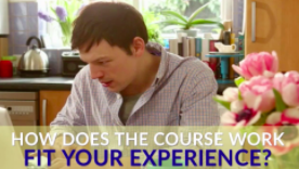
Start with a succinct slide that sets the stage for your viewers. It can be a title or a statement or question that piques their interest. Make it thought-provoking, emotionally resonant – something potential viewers can relate to, or identify with.
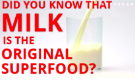
Make the text large and in-your-face, so it can’t be missed in cluttered social feeds. You’re safe making this first slide larger than any other text in the video. The goal is for it to be tone-setting and hard to forget.
Text Slides Can Take Different Forms
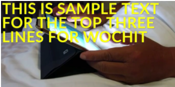
Depending on what works best for an asset, you have the option to orient text-overlay to different areas of the frame: to the top, from the left, to the bottom, or from the right. We recommend sticking to two different colors. The colors are yours to choose, but we have found that white, sky blue/aqua, and yellow/goldwork especially well as overlay.
When orienting from the top, be sure to use no more than 3 lines so as to not stretch more than halfway down the frame. Also, if you have any branding in the top right corner, be sure you keep the text from covering it up.
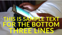
Similarly, when orienting to the bottom, use no more than 3 lines and don’t stretch more than halfway up the screen. Center justification often looks best for text at the bottom of the frame. Remember to try to fill the area with text by adjusting the size of each line. Generally, no line should exceed size 80, or be under 30.

When orienting to the right or left, be sure to align the text to that side of the frame. Keep your text box from coming more than halfway across the screen and try to use one size of the text for the whole slide. Be sure to avoid covering any logos in the top right, as well.


Know All Your Best Practices
You want your videos to move quickly. No slide should be up for longer than 4-5 seconds. You can break up sentences with text timing keep it over the same asset.
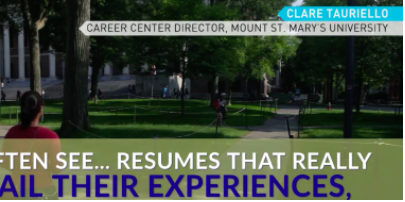
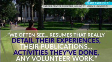
Quotes are an exception to the 4-5 second rule. With quotes, try not to have your text box take up more than half of frame, and don’t go smaller than 30 unless you absolutely have to. Split your quote into more than one slide with an ellipsis if needed.
When using a quote, always create a Super acknowledging who the quote is from. Generate the name first on top, followed by their title. If you are using more than one text slide or more than one video clip, you only need to add a super once (for the very first video clip or text slide).
If you’re uploading an asset from social, be sure to always give credit. We recommend a SOURCE / USER format (such as, INSTAGRAM / KIM KARDASHIAN).
To help readability, try splitting up the colors of your text line-by-line. It’s also ok to accenting individual words or phrases to make them pop out.
When the colors and qualities of an asset make it difficult to place raw, readable text over it, you can utilize an overlay box. They add a background of color to the text box to help it stand out over a visual asset. Generally, try not to go darker than 65-75% opacity.
Text-overlay is now as much a part of social video as the moving image. With viewing happening on-the-go more and more, it will continue to be an important element of every video publishers push out online. With our tips in hand, any creator is ready to optimize text with the Wochit platform and craft videos that truly worth sharing.