
No matter where you go these days, it seems like everyone is focused on their mobile phones, so it should come as no surprise that mobile video is growing — and fast.
As of March 2015, 41% of all digital video views worldwide were done on mobile and Cisco predicts that 79% of all mobile data traffic will be video by 2019. Mobile video isn’t just an additive possibility, it’s something you can bet on.
This is why it’s critical for creators to make sure their videos look great on those tiny screens. Here are some tips do make the most out of the mobile video revolution:
For the small screen, think big…
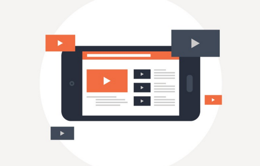
It may seem counterintuitive, but those small mobile screens need BIG content. This means images and text that are easily understandable and readable at most any size, and bold, simple thumbnails to catch eyes and instantly convey the subject of your video.
Flashy, highly-detailed animations or infographics in your video that might look great on the big screen can be hard to understand on a phone, so make sure you test things out.
If viewers have to squint to make out the message, they’re just as likely to not read it at all.
— but keep it short!
For social video, shorter is almost always better, and it’s doubly true with mobile, where attention is extra-deficit and distractions are available in spades.
Keep the eyes on your video by getting the viewer in and out quick – the best performing videos don’t spend a lot of time on transitions or filler, they make their point and get out.
And make sure everything works
Many people make the mistake of designing their websites for desktop and not rigorously testing their mobile experience.
While hosts like YouTube have players that naturally adjusts to screen-size and orientation, if you’re hosting or embedding your own content, you need to give special consideration to how your video reacts to a mobile viewer.
- Does your player resize and reorient appropriately?
- Are your annotation short enough to be read without taking up too much space on a mobile screen?
- Are your CTAs and other user actions big enough for touch navigation?
- Do the pages or actions they trigger work on mobile?
These things are just as important to keep in mind when designing a positive mobile viewing experience for your audience.
Not every content is right for mobile video
The subject and content of some videos restricts how accessible they are to mobile viewers. Certain complicated tutorials or in-depth training videos require a level of attention that make them poor candidates for mobile viewing.
These videos are still important, so think about how you might repackage part of them for mobile — try pulling interesting clips and making short “trailers” to pique interest and give people the link to the full piece for example.
Remember, on certain platforms, like Facebook, you can target videos to desktop or mobile only users, so choose accordingly!
We’d love to see you putting these tips to work, so link us to your mobile-optimized videos or shoot us screenshots of your eye-catching thumbnails to: blog@wochit.com.